Asanka EO

Asanka EO – Design

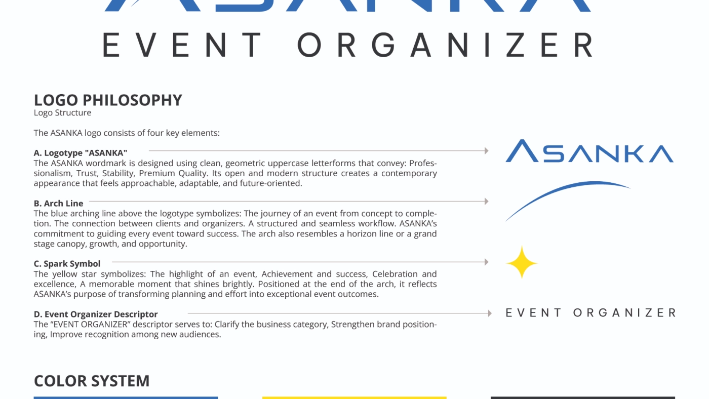
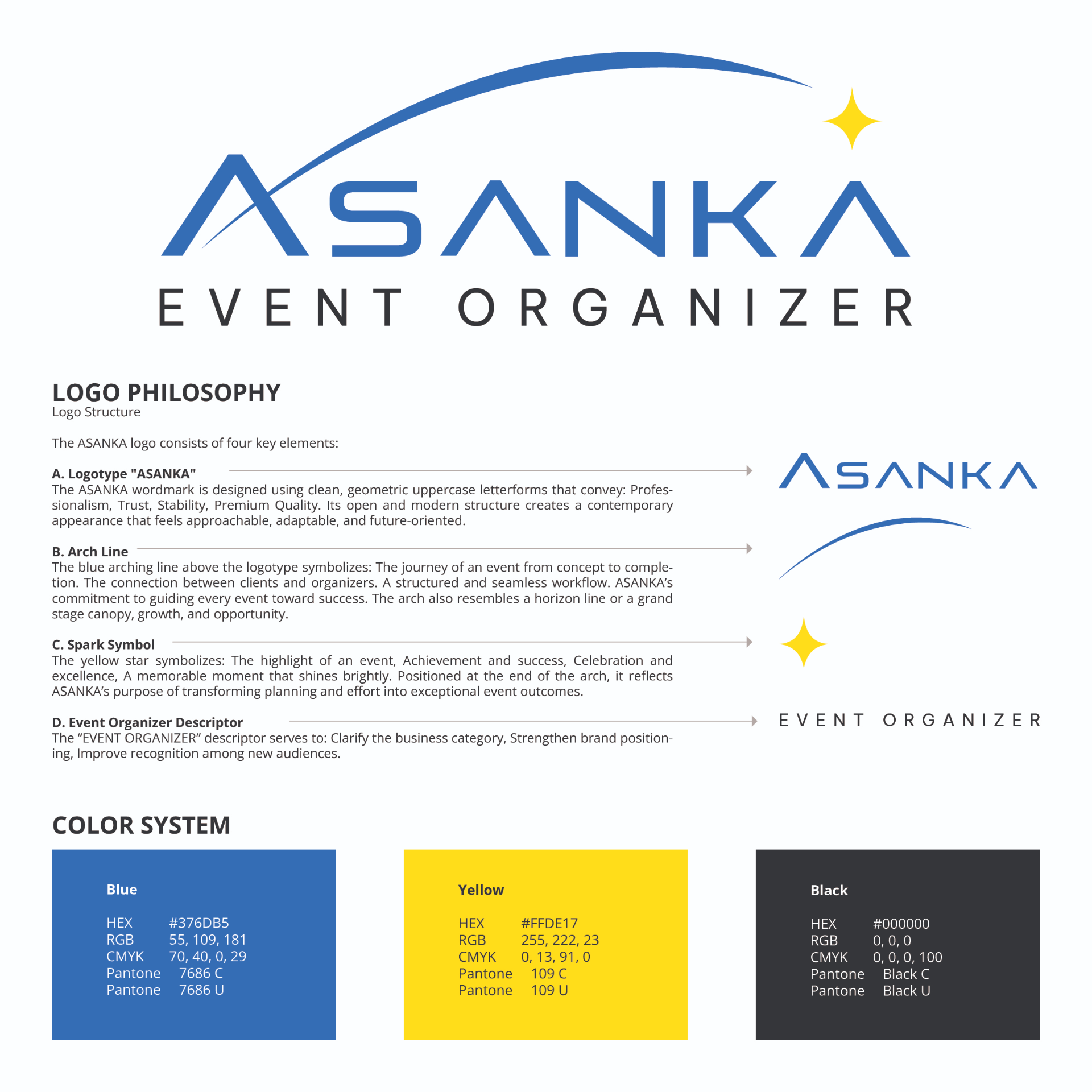
Asanka developed the visual identity for Asanka EO around a geometric wordmark, an arch representing the journey of an event, and a spark marking moments of celebration and achievement. A blue and yellow color system adds a balance of professionalism and energy to the overall identity. The result gives Asanka EO its own recognizable character while maintaining a visual connection to the Asanka brand.
Asanka EO is a division of Asanka that manages a wide range of events, including corporate functions, seminars, gatherings, product launches, exhibitions, and community activities. This division helps turn each client’s goals and ideas into a clear event concept that matches the intended audience. Every element is developed to support a consistent message, atmosphere, and overall experience.

Asanka EO is the right partner when you want to organize an event but do not yet have a clear concept, a dedicated team, reliable vendors, or enough time to manage every detail. The service is also suitable for events that involve multiple parties, require specific equipment, or follow a tight schedule. Clients only need to provide the main objective, target audience, event requirements, and available budget as the foundation for the planning process.

By working with Asanka EO, clients receive support in event concept development, program arrangement, venue selection, production requirements, vendor management, and on-site coordination. The team ensures that every element works together effectively, allowing clients to focus on their guests and the main purpose of the event. The result is an event that feels relevant, runs smoothly, and leaves a strong impression on every participant.

Aura Batur

Aura Batur

Aura Batur is a local adventure service in Kintamani that offers Mount Batur jeep experiences, combining 4WD trips with local drivers and curated itineraries around the volcanic landscape

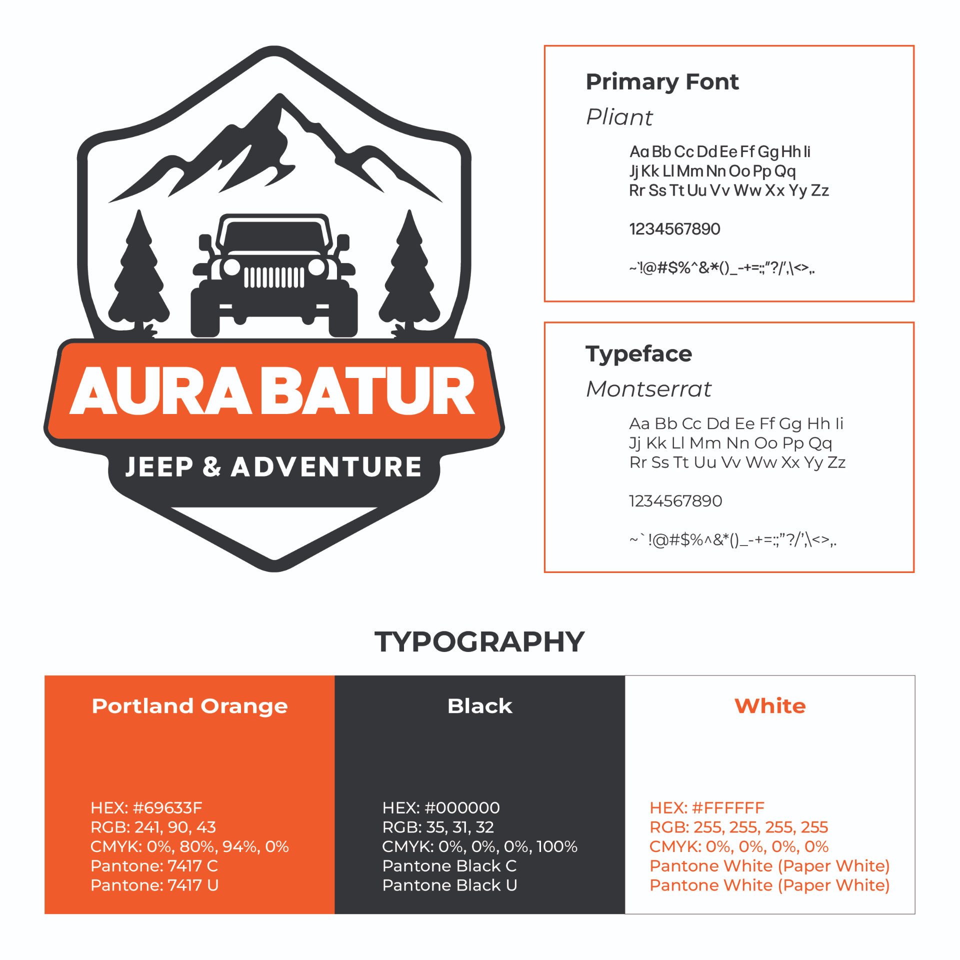
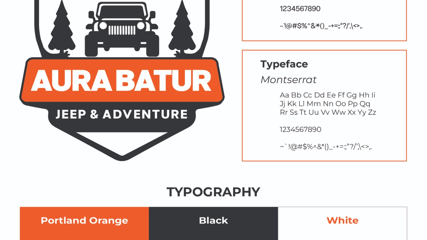
Asanka developed the brand identity through the logo, typography, and color system, using visual elements of mountains, pine trees, and an off-road jeep to represent the experience directly. The bold badge-style identity and orange, black, and white palette give Aura Batur an adventurous and outdoor character, helping the brand communicate the rugged nature of its Jeep & Adventure services at a glance.

Dewandaru

Dewandaru – Design

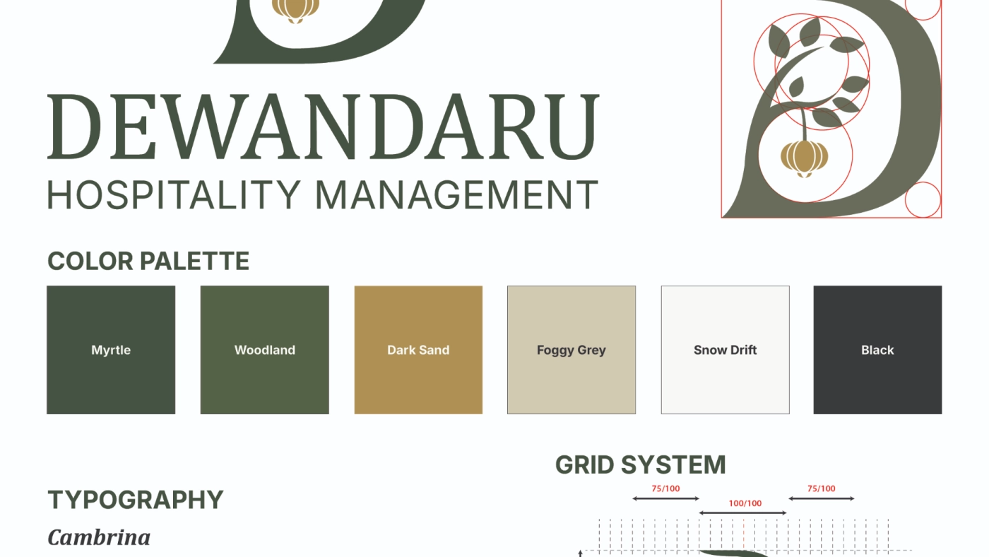
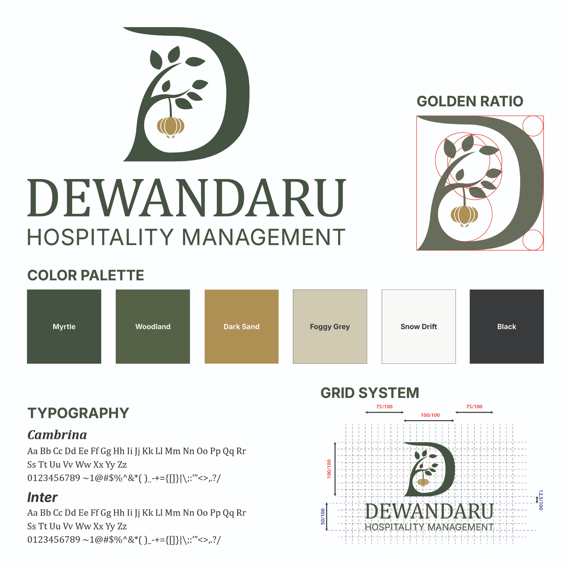
Dewandaru is a private web-based platform created to support the internal operations of Think Pink, a Bali beauty destination offering nail, hair, facial, brow, waxing, tanning, and massage treatments.

Unlike its public-facing website, this platform is accessible only to authorized users through a secure login, indicating that it was designed for internal business use rather than customer promotion. Asanka developed the platform as a custom and protected digital system, providing the Think Pink team with a centralized environment to support its operational activities and manage access more securely.

Nirave

Nirave

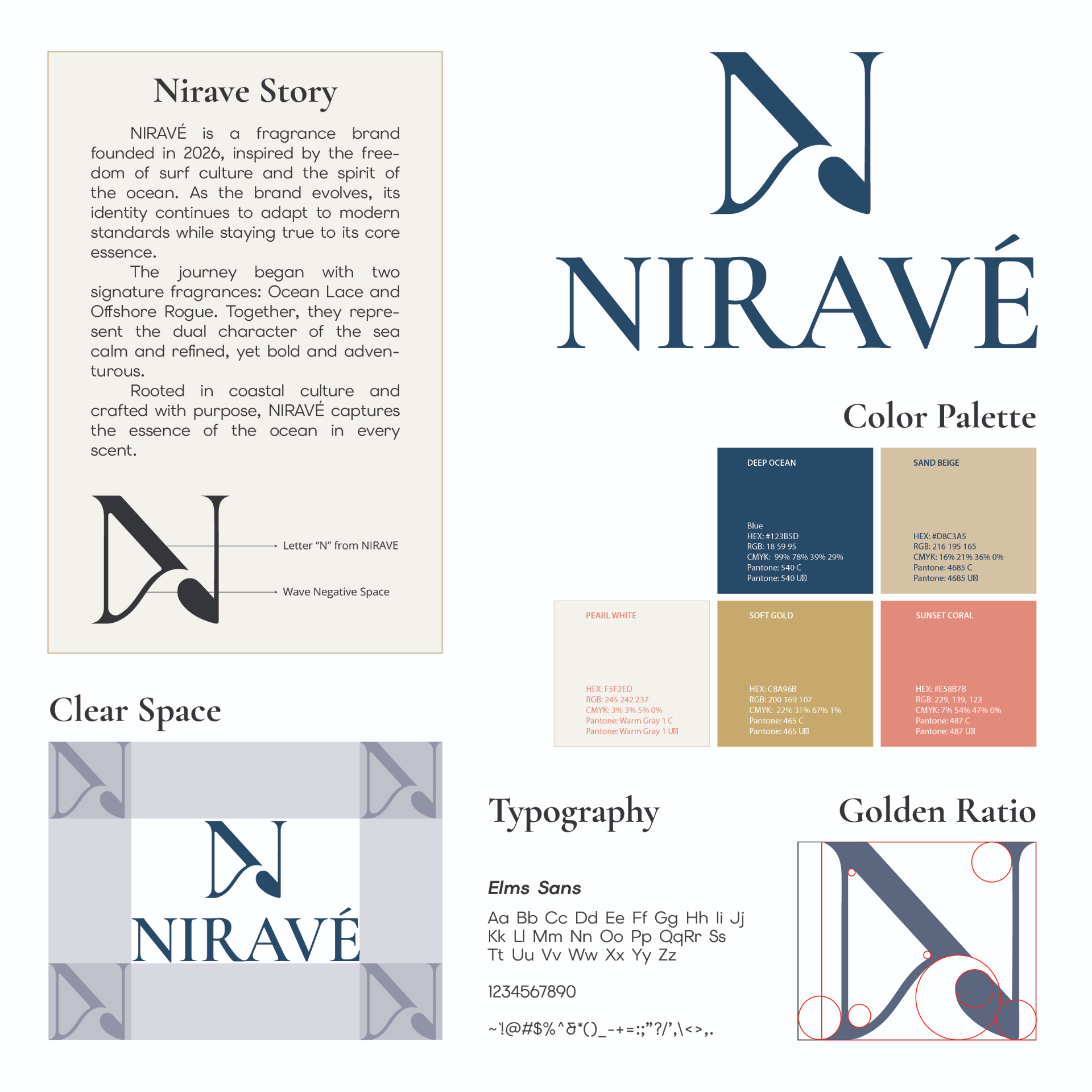
Nirave is a fragrance brand inspired by surf culture and the spirit of the ocean, beginning with two signature scents, Ocean Lace and Offshore Rogue.

Asanka developed the brand identity through its logo, color palette, typography, and supporting visual system, using elements drawn from waves and coastal tones. The design gives NIRAVÉ a refined yet adventurous character, helping the brand express its connection to the sea while keeping a consistent identity across different applications.

Blioleh

Bli Oleh

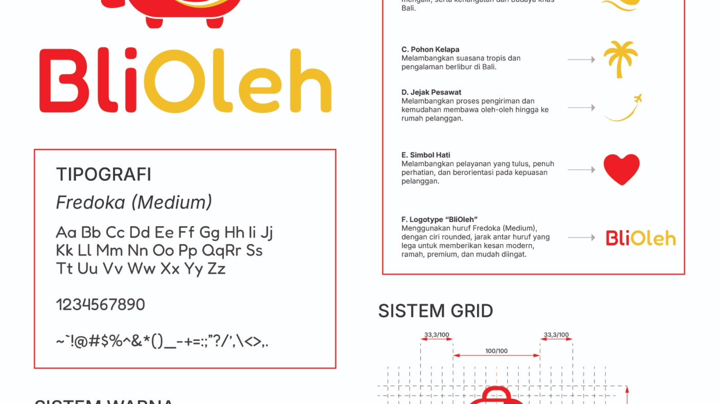
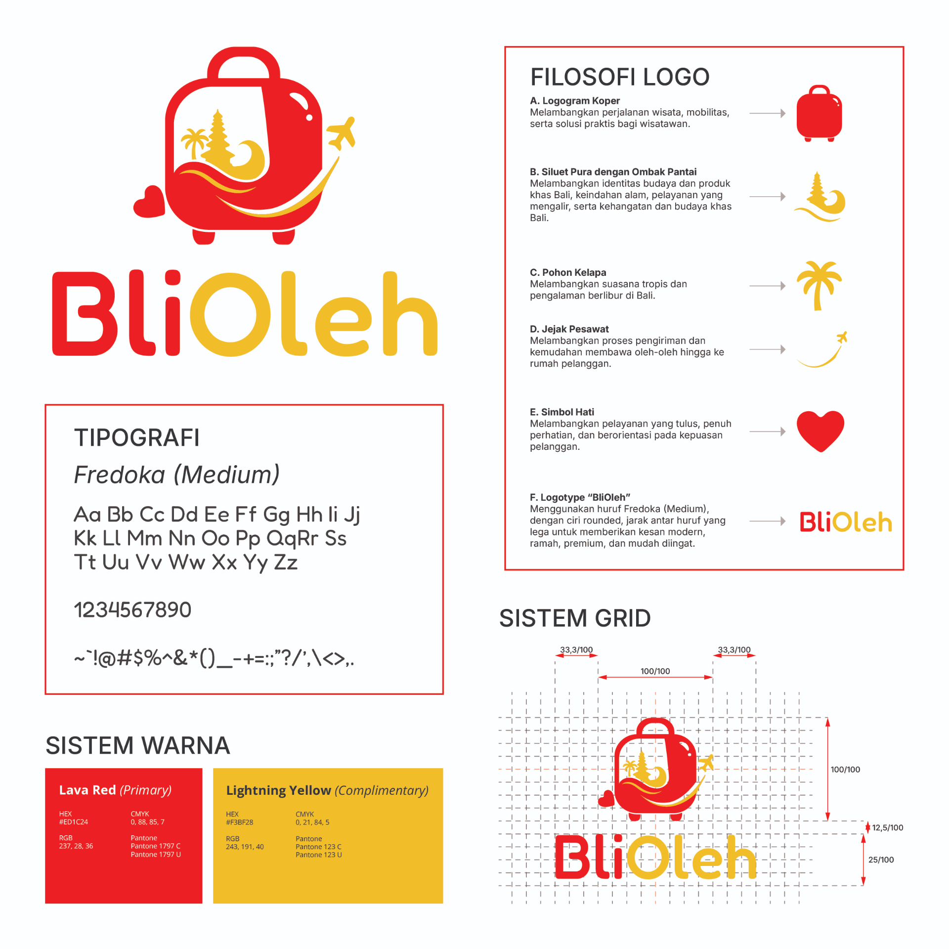
BliOleh is a Bali-focused souvenir brand built around the travel experience, offering an easy way for visitors to bring a piece of the island home.

Asanka developed the brand identity and logo by combining a suitcase with elements of Bali, tropical scenery, travel, and hospitality into one recognizable visual. The identity gives BliOleh a friendly and accessible character while representing its connection to Bali, convenience for travelers, and warm service.

Tixgro

TixGro

TixGro is a digital ticketing platform for purchasing tickets to events such as concerts, seminars, and meetings.

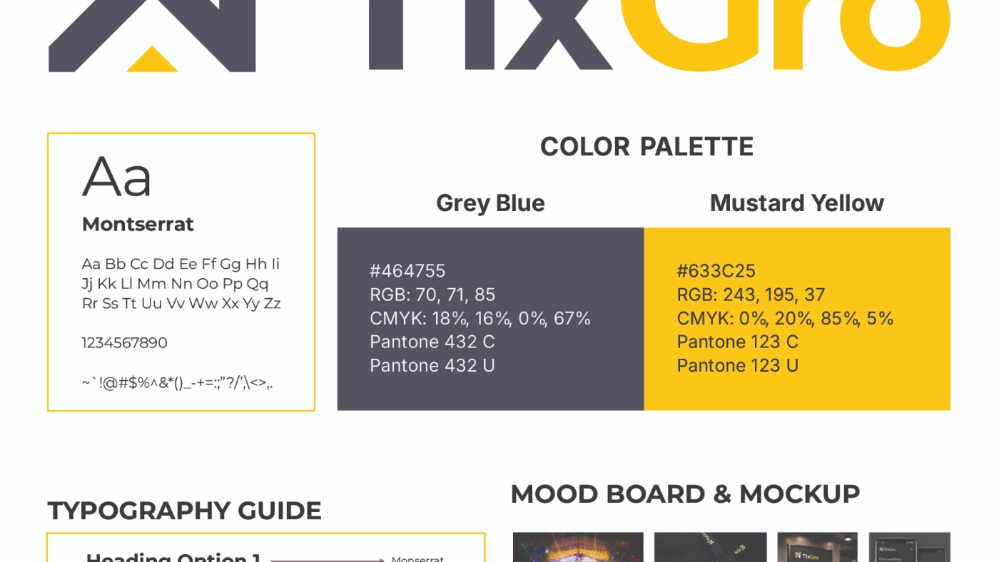
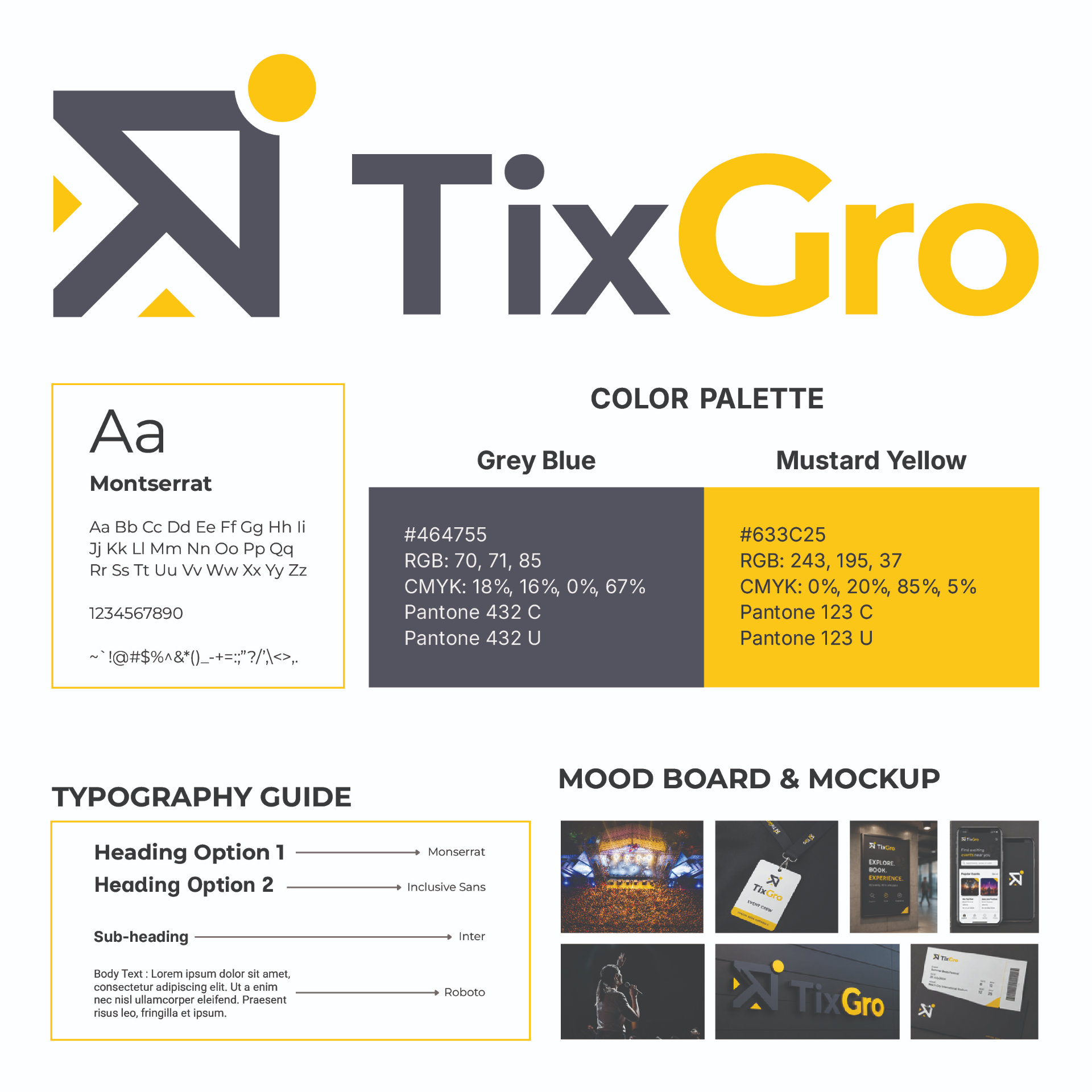
Asanka worked on TixGro’s brand identity, developing the logo, color palette, typography, and visual applications to create a consistent look across different brand touchpoints. The identity combines bold geometric forms with grey-blue and mustard yellow tones to give TixGro a fresh and modern character, in line with the platform’s own positioning around growth, creativity, and innovation.